


Data Storytelling
Putting complex data into an easily understandable form

Imagine you are part of a company that collects large amounts of data but has difficulty turning that data into useful information. Or maybe you are part of an organisation that is trying to put complex data into an easily understandable form to make decisions. In both cases, data storytelling can be a valuable solution. Data storytelling is a method of presenting data in a descriptive way to convey a message or a specific outcome. Read this article to learn how Data Storytelling can be used to transform data into useful information and to make decisions.
What is Data Storytelling?
Data Storytelling uses visual elements such as charts and graphs, as well as a clearly structured narrative, to present data in a clear way so that a message or a specific outcome can be conveyed. This type of presentation makes it easier for the audience to understand the information as well as to remember it afterwards. Data Storytelling can be used in many areas, such as business decision-making, project management or presentations.
How does Data Storytelling work?
Data Storytelling works by presenting data in a way that makes it understandable, emotional and interesting to the audience. When creating your data story, the following steps can help:
1. Identify the goal of the story:
Each story should have a clearly defined goal. So ask yourself what you want to express with your story. What do you want the audience to achieve after hearing the story? What do you want the story to convey?
2. Collect all relevant data:
Make sure you have all the data you need to tell your story. To do this, put yourself in the shoes of your target audience and think carefully about what data is needed. Also make sure to provide the data in the right context, for example, to give comparative values. At the same time, already in this step you should be careful not to select too much data so that your data story does not become overloaded.
3. Prepare the data:
Clean and format your data so that it is ready for further analysis and presentation. Also ensure that the data quality is high, i.e. the data should be complete, up-to-date and correct. Therefore, you should also check the data for errors, inconsistencies or duplicates.
4. Visual representation:
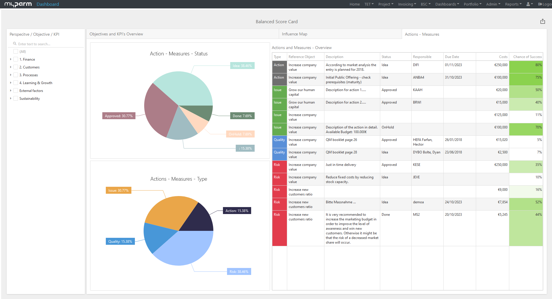
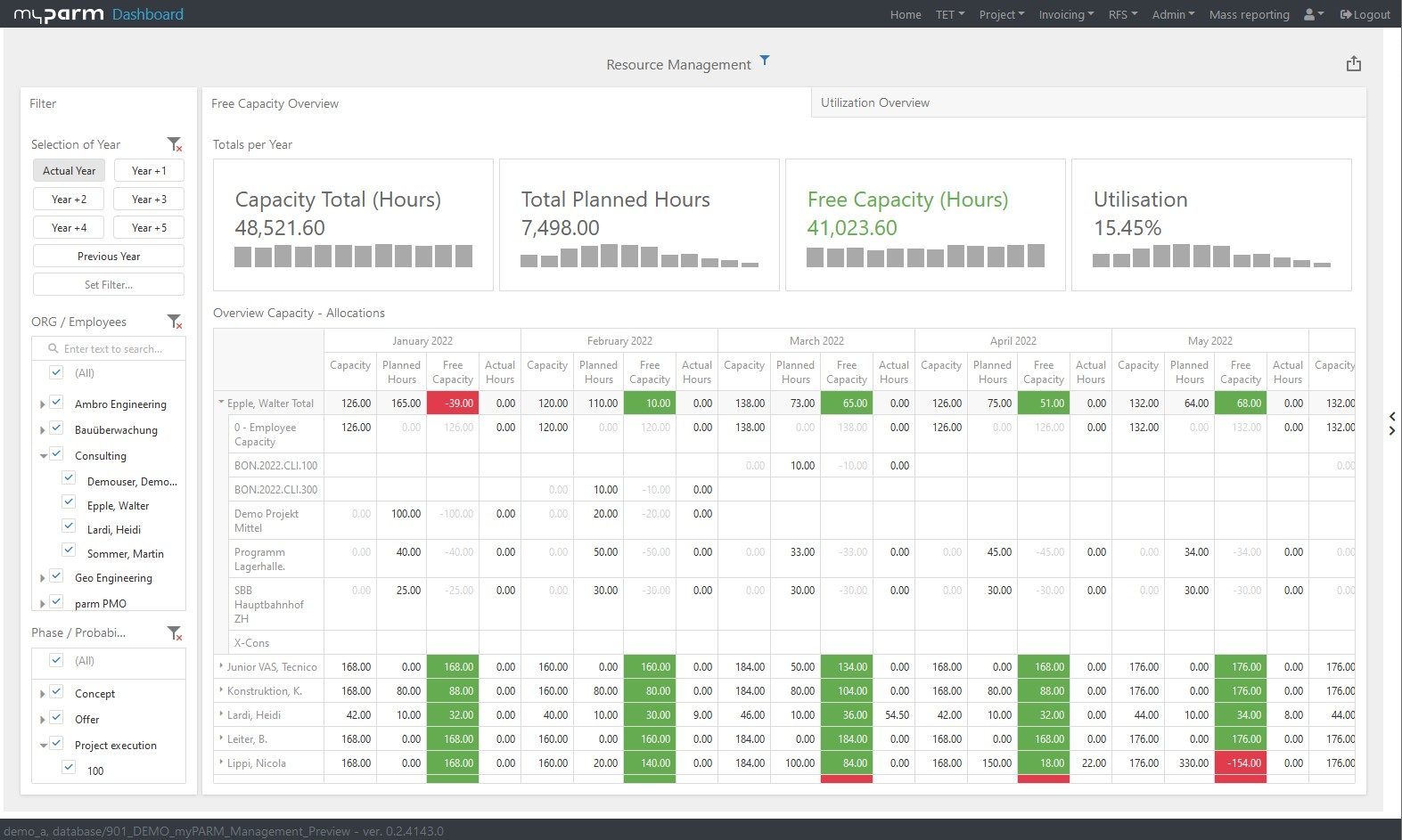
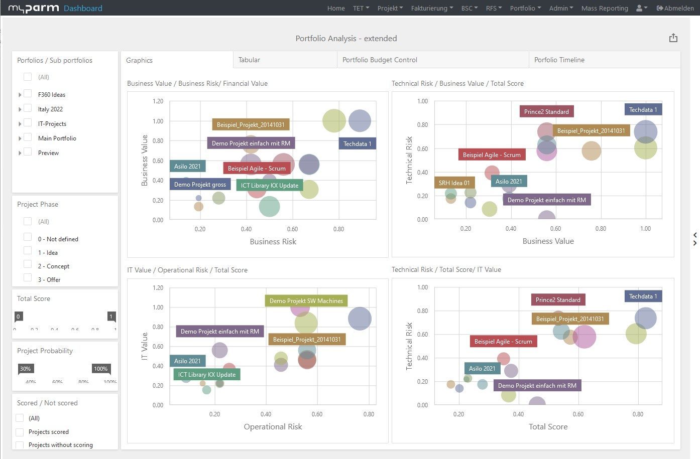
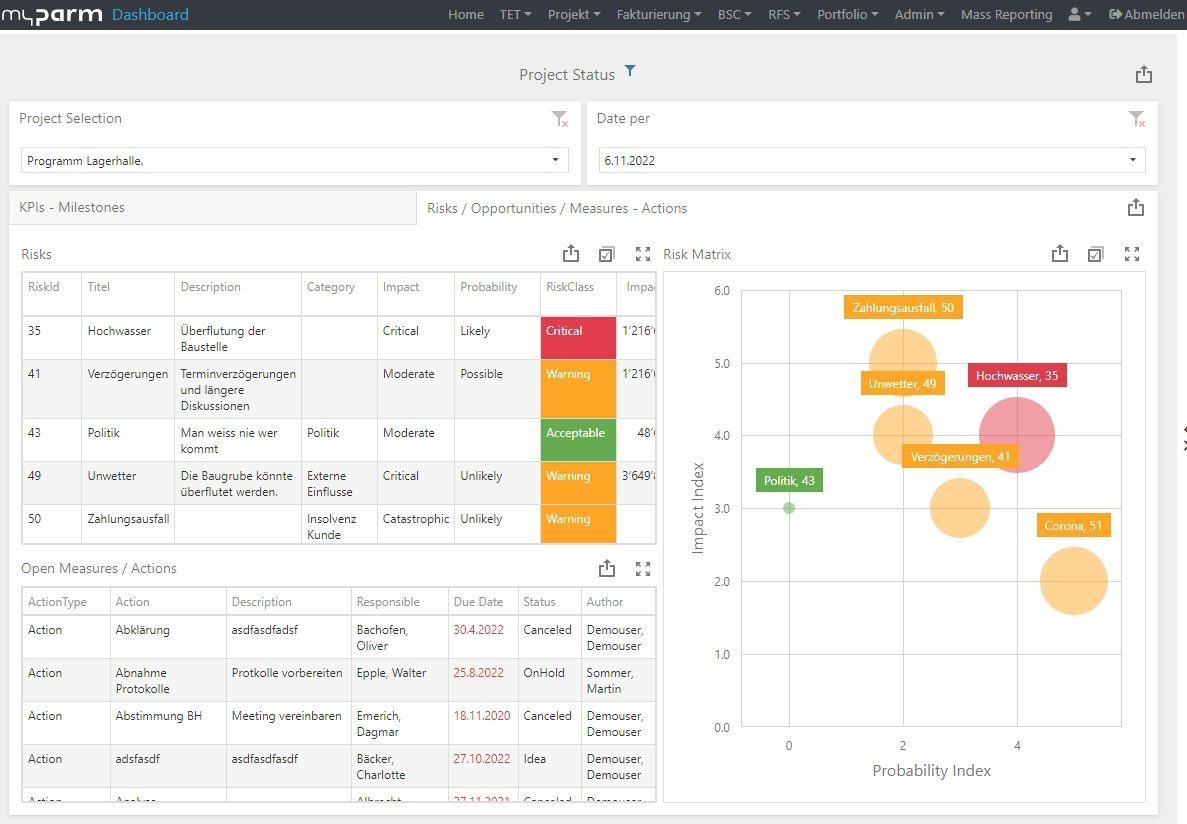
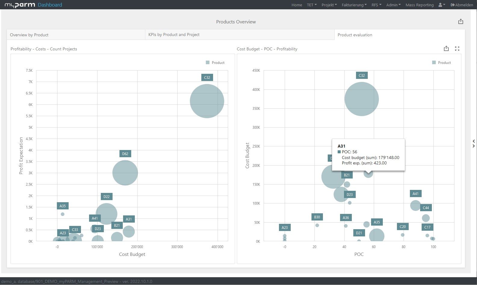
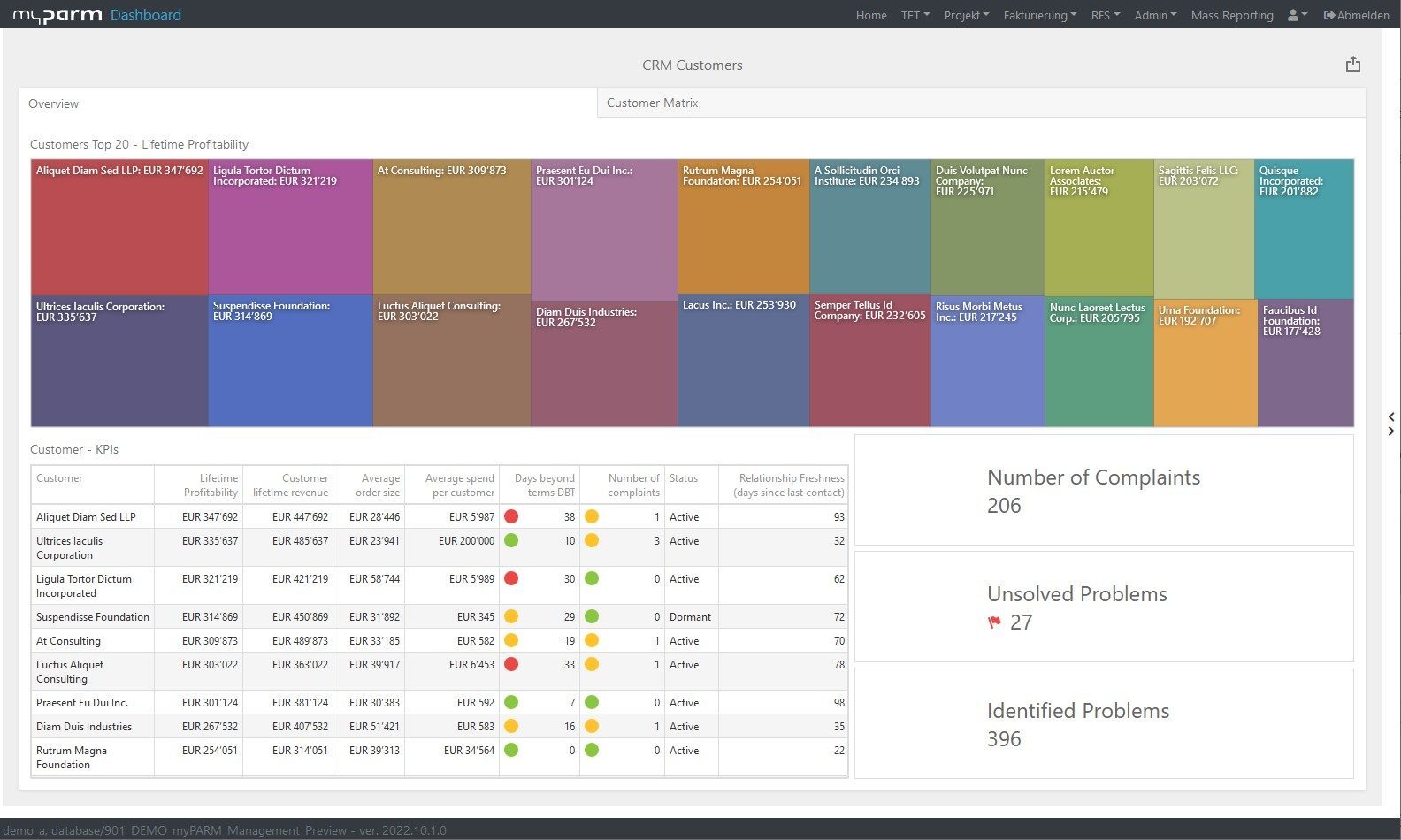
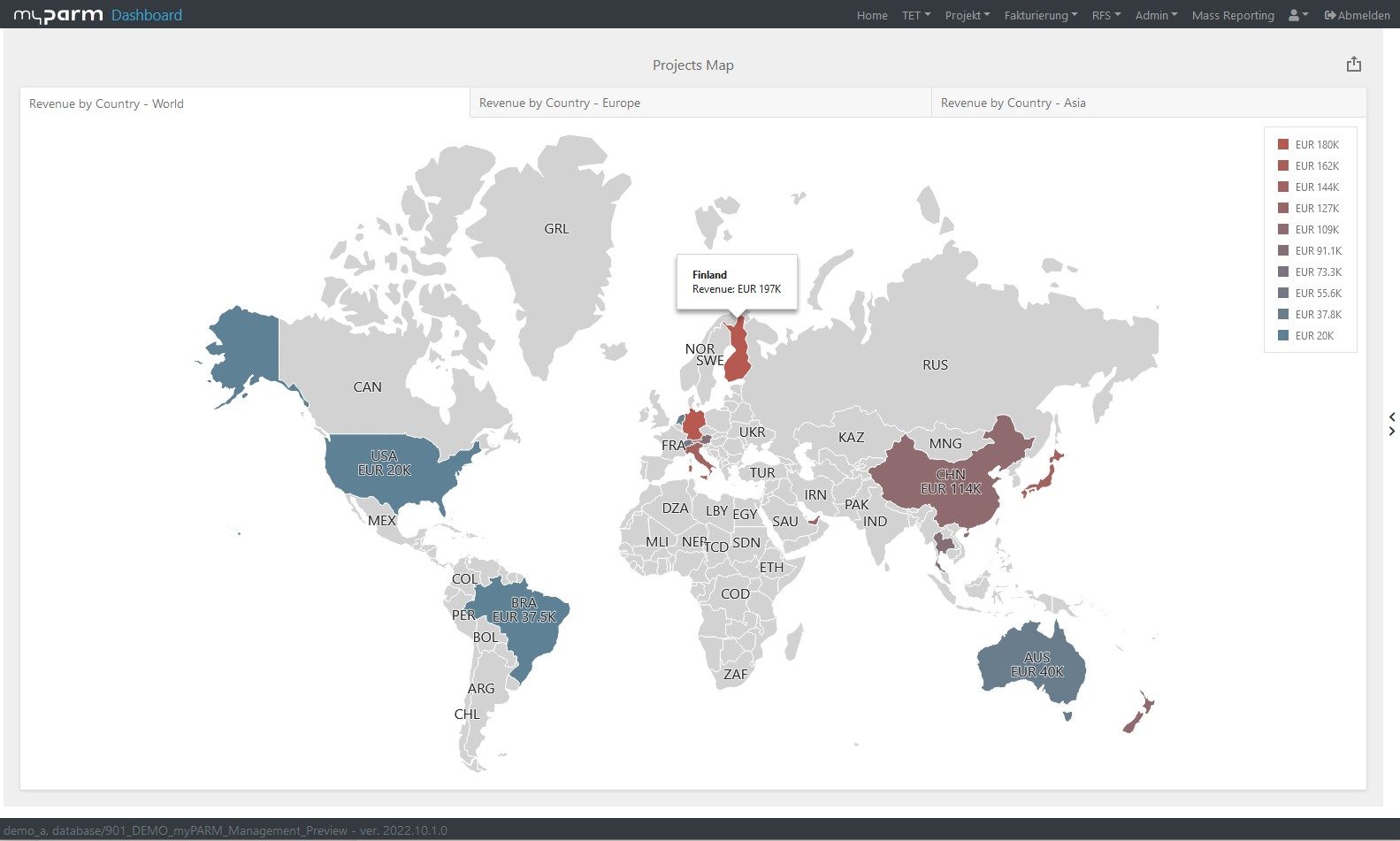
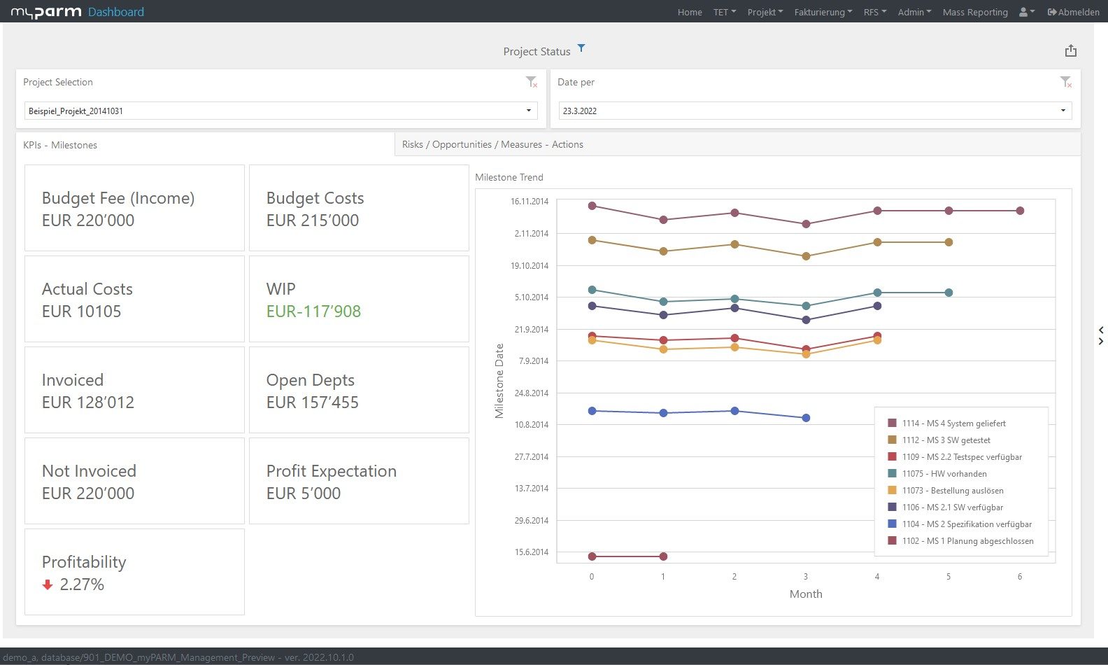
A picture is worth a thousand words. So create charts, graphs, maps and other visual elements to present the data and support the message. Are you unsure which visualisation is suitable for your data? Then learn how to make an optimal choice in the article "How to design an optimal dashboard".You can also read there how the perception of information via a dashboard can be optimised, for example by changing the position, size or orientation of the graphics. Be sure to name the data clearly, for example, label the axes in a chart.
5. Structure:
Create a clear and logical narrative structure that allows the audience to quickly understand the data and its meaning. To do this, structure the data logically and at the same time present it as simply as possible.
6. Interactivity and presentation:
Present your story in a way that allows the audience to interact. Use tools such as dashboards or presentation software to capture the audience's attention. Interactive elements can add value to your story, for example drill downs allow you to show a detailed version of the data, while filters allow you to focus on a subset of the data.
7. Feedback:
Let the audience comment on your story and give feedback. You can use this in the future to improve your techniques and the way you tell the stories.
How to write a good data story?
The plot of a data story usually consists of three parts - an introduction with the basic question, a main part explaining the data and its analysis, and a conclusion.
1. A question or problem:
A data story begins with a question or problem to be investigated or solved. This may include the context of the analysis, the nature of the data, methods used or challenges faced. Start by explaining the initial situation, e.g. what metrics are being looked at and why they are important for business success or your fundamental goal.
2. Body:
The main part of your story serves to answer the initial question with the help of your collected data. In your data story, the data serves as the protagonists on the one hand, and on the other hand it forms the framework for the plot. To facilitate understanding and support your message, this data can be presented visually.
A well-structured narrative, or presentation, helps the audience to easily understand and follow the information. There are several narrative options available to you for this purpose:
- Drilldown: In a drill down, you go from general data to more specific, usually more detailed data.
- Zoom out: Here you proceed in the opposite way to the drilldown and first show specific data before moving on to more general data.
- Change over time: Here you explain how the data has changed over a period of time.
- Contrast: If you have chosen two or more protagonists, you can compare them.
- Intersection: In this narrative variant, you work out at which point your data protagonists intersect.
- Outliers: Here the focus of the narrative is on outliers within your data.
- Factors: In this narrative perspective, you illustrate how different data sets are related to each other, or what causalities exist between them.
When writing your data story, make sure that you engage your audience emotionally to get them to identify more strongly with your message. To do this, you can make parts of your story interactive to allow the audience to explore the information in different ways.
3. Conclusion and recommendation:
A good data story ends with a conclusion based on the data and its analysis, as well as concrete recommendations for future action.
What makes a good data story?
A good data story is characterised by a combination of facts, logic and emotion. The following factors can contribute to creating a good data story:
- Clearly defined goal: A good data story has a clearly defined goal it wants to achieve and ensures that the audience understands it and focuses on this goal.
- Relevant data: A good data story uses only the data that is relevant to the goal of the story and presents it in a way that the audience can understand.
- Logical narrative structure: A good data story has a logical and well-structured narrative that allows the audience to easily understand and follow the information.
- Visual presentation: A good data story uses visual elements such as charts, graphs and maps to present the data and support the message.
- Emotional appeal: A good data story has emotional appeal by engaging the audience emotionally and making them identify more strongly with the message.
- Interactivity: A good data story is interactive and allows the audience to explore and interact with the information in different ways.
- Timeliness and consistency: A good data story is up-to-date and the data used is consistent as well as not outdated.
- Ethics: At the same time, a good data story respects ethical aspects such as data protection and privacy and ensures that no improper conclusions are drawn.


The advantages of Data Storytelling
- Understandability: Data storytelling presents data in a way that makes it understandable and easily accessible to the audience. This allows valuable insights to be gained and shared.
- Emotional appeal: By telling a story, you can engage the audience emotionally and get them to identify more strongly with the message.
- Increased memorability: A well-told story is easier to remember than mere facts and figures.
- Decision support: Data storytelling can help make decisions by providing clear and easy-to-understand information. For example, it can be used to stay very focused in discussions.
- Better collaboration: By teaching data experts to speak the language of other stakeholders in the company, collaboration can be optimised.
The challenges of Data Storytelling
- Time-consuming: Data storytelling can be very time-consuming, especially when it comes to preparing the data and packaging it into a story.
- Subjective: There is a risk that the data will be interpreted subjectively, depending on how the story is told and who is telling it.
- Distortion of reality: By highlighting certain data and suppressing others, there is a risk of distorting reality and giving an incomplete or false picture. Therefore, when creating the data story, it should be carefully checked whether the insights gained are actually accurate.
- Too much data: There can be too many visual elements or information that distract the audience's attention from the most important points. Therefore, it is important to focus on relevant information only.
Conclusion
Data Storytelling is a valuable way to present data vividly to convey a clear and compelling message. By using visual elements and a well-structured narrative, the audience can understand and remember the information more easily. In this way, Data Storytelling can support you in many areas.
Business intelligence software can help you create your data story and shape it. Convenient analysis functions, various options for visualising the data as well as the possibility to create your own dashboards and reports simplify the writing of your data story.
Weitere Informationen über die Business Intelligence Software myPARM BIact:
Möchten Sie myPARM BIact in einer Demonstration kennenlernen? Dann vereinbaren Sie gleich einen Termin!