How to design a meaningful dashboard?
Design basics and tips for choosing the right charts
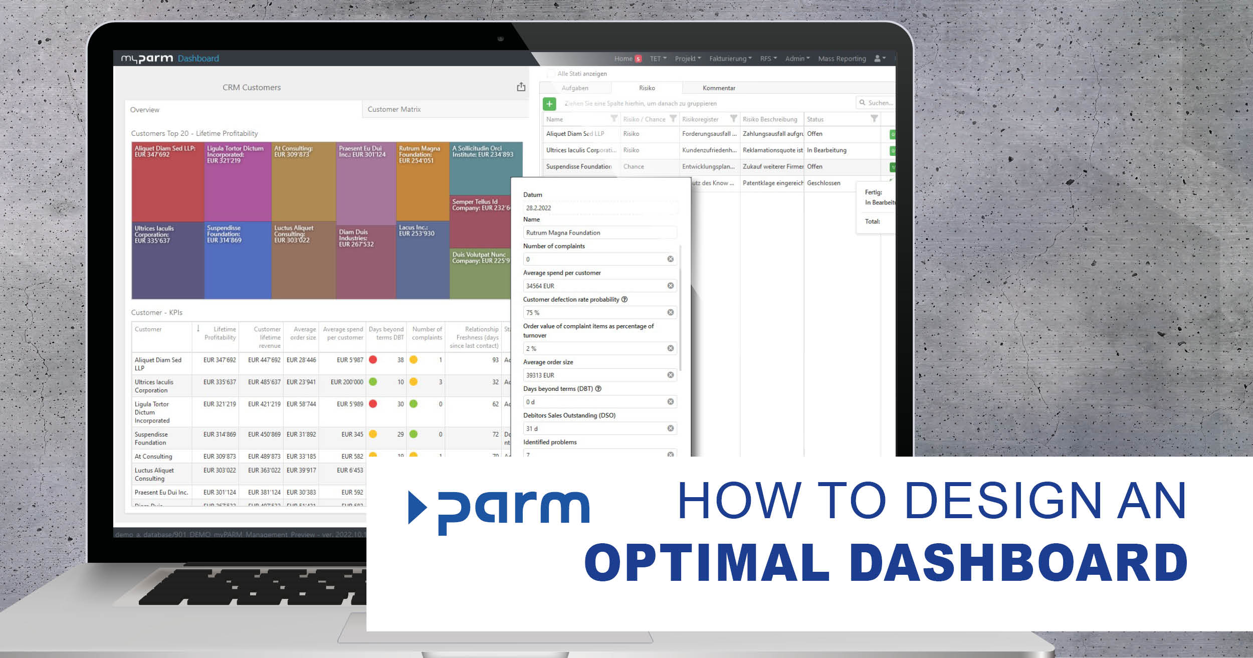
Whenever possible, business decisions should be made on the basis of meaningful data. However, it is not easy to overview extensive data tables and to derive insights from them. In order to quickly grasp the data, make it easy to understand and share it with others, it therefore makes sense to visualise it. Clear dashboards are therefore an indispensable part of everyday business life. Modern self-service business intelligence solutions, for example, allow data to be queried, analysed and displayed in customised dashboards. These systems offer a wide range of possibilities that can be put together simply at the click of a mouse. However, this makes it difficult to decide what a meaningful dashboard should look like. But you can only achieve maximum benefit with a well-designed dashboard.
What should a dashboard look like?
A well-designed dashboard should present all important data to the viewer at a single glance in an easily understandable way. Therefore, it should contain only the data that is needed and illustrate it in a clearly structured way. When designing a dashboard, you can use the following basic tips as a guide:
1. Keep the target audience in mind
Ask yourself which target audience the dashboard is aimed at, what questions it should answer and what data is needed for this. This will allow you to identify the most important information and metrics for the target audience and decide how best to present them.
2. Limit the amount of information
It is often difficult to limit oneself to only a few, relevant data. Therefore dashboards quickly become overloaded with information. However, this prevents a viewer from grasping all the important data at a glance. Therefore, keep your target audience in mind and choose the relevant data wisely.
3. Present data in the right context
Without the right context, it is difficult to assess the data provided. Therefore, in most cases it makes sense to provide comparative values, e.g. the values from the previous time period, set targets or planned values. You should also make sure to clearly name the different charts in your dashboards as well as label their axes so that every viewer can understand them.
4. Structure the dashboard
In order to be able to see all important data at a glance, dashboards should be designed as simply as possible and have a good structure. Overly complex representations prevent the quick understanding of information. If, on the other hand, the individual elements on the dashboard are placed correctly, the data can be grasped quickly.
Our tip: Make sure to place the most important information at the top left so that it is seen first. To further highlight them, you can also display important data in a larger size. Details and background information can then follow further down. In addition, information that is related to each other should be placed next to each other if possible.
5. Choose the right charts
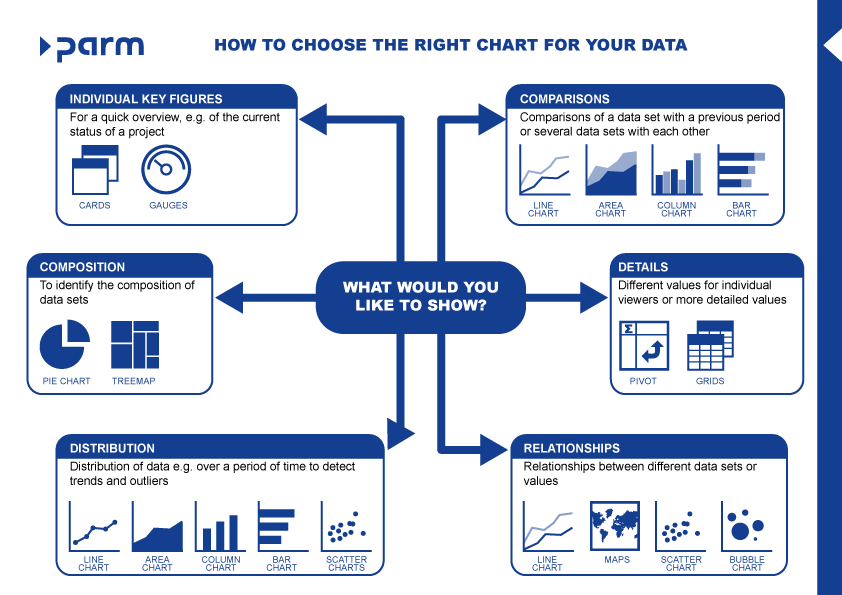
Choosing the right types of diagrams is crucial for the informative value of your dashboard. Therefore, it is first important to understand what information is to be conveyed and what type of diagram is suitable for this. This will allow you to choose the optimal chart type for your purposes.
6. Use colours wisely
Colours can also be used to convey information without words, as they can highlight important data or have a signalling effect on your dashboard, for example when you use traffic light colours to mark positive (green) or negative values (red). However, this signalling effect can cause confusion if applied in the wrong context and is quickly lost if many saturated hues are used at the same time. Therefore, it makes sense to use such colours sparingly.
Our tip: Use only two to three colours that are repeated in the individual diagrams. You can then represent related information with different shades of these colours, for example, so that they are easily recognisable. his way you will get a harmonious overall picture. In addition, you should make sure that the different elements of the dashboard are clearly delineated from each other in order to simplify the overview.
7. Use interactivity
Interactive elements allow a viewer to click to see more information or details while maintaining the clarity of the dashboard. Drill-downs, for example, allow data to be accessed in more detail, while filters allow your viewer to focus on a subset of the data. Use these options wisely to give your dashboard viewers exactly the information they need.
How to choose the right chart
The right format for each visualisation should be chosen wisely to convey exactly the information that is essential. There are many options available - depending on whether you want to show a single metric, relationships, distributions, compositions or comparisons.
-
Cards:
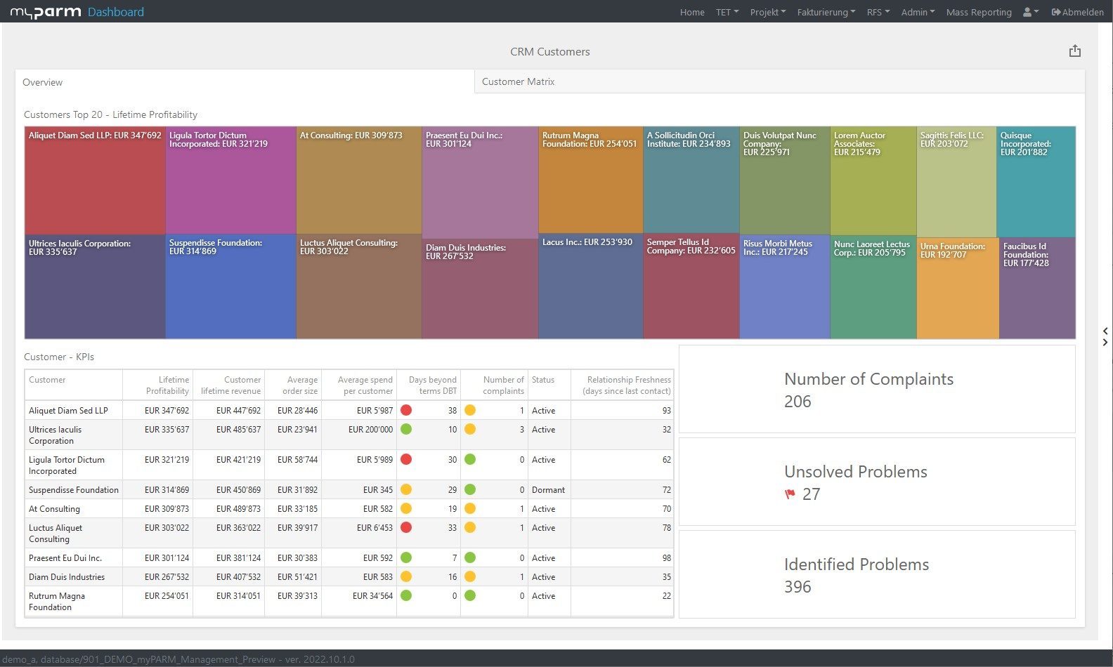
Cards show a single key figure. They can be used, for example, to quickly display an overview of different key figures of a project in real time.
-
Tree maps:
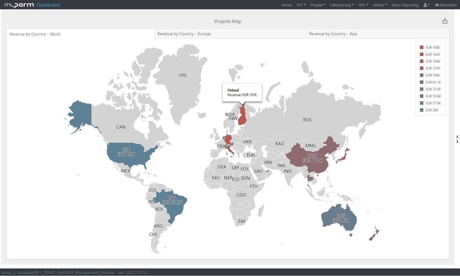
Tree maps or tile charts show parts of a whole as rectangles, with the size and colour of the rectangles depending on the data values. This makes it very easy to see patterns.
-
Bar and column charts:
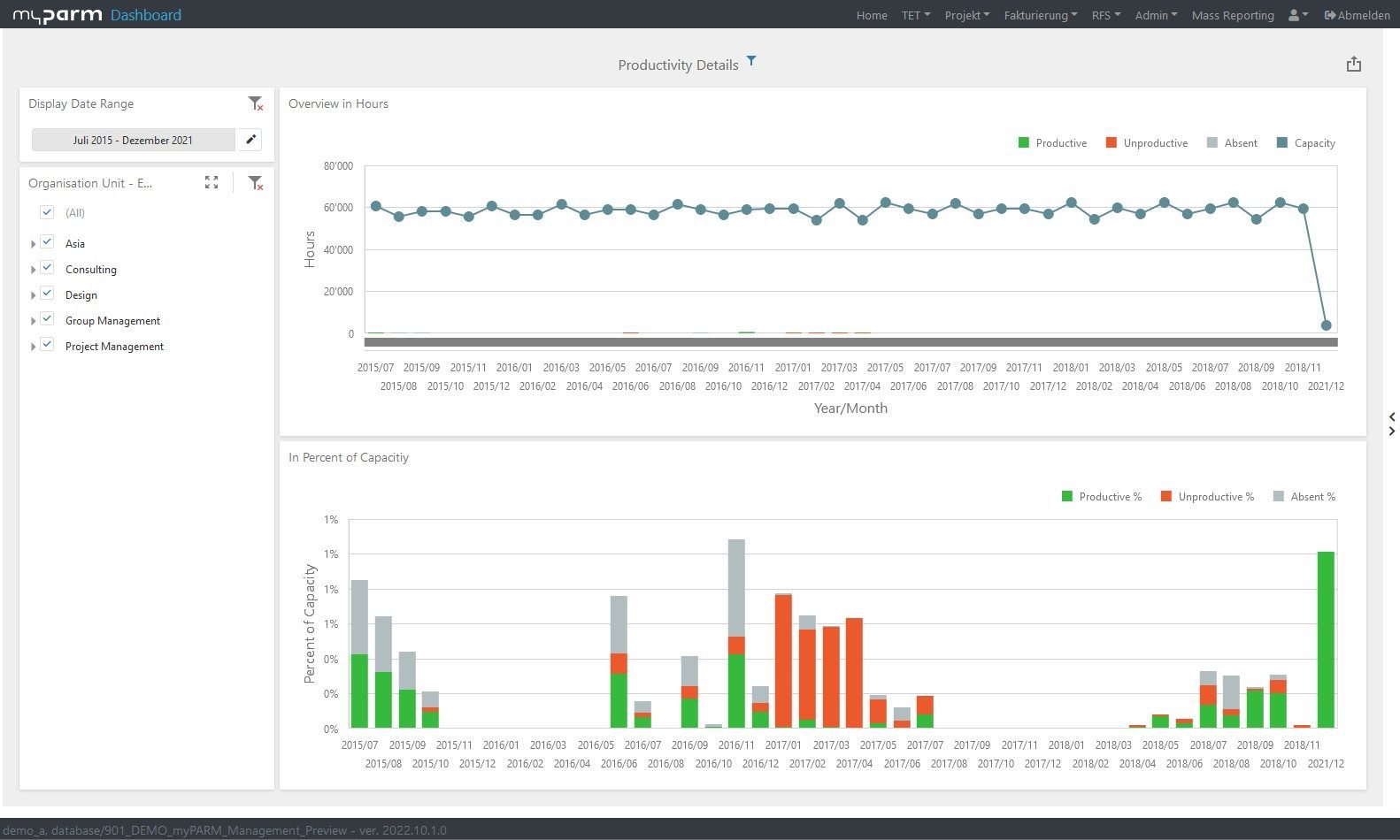
These charts compare different elements. In a bar chart, the bars are horizontal, while in a column chart they are vertical. Bar charts are used especially when long data labels or a comparison of more than 10 elements is to be made, as they are clearer than column charts in these cases. In addition, there are stacked column and bar charts, which make it possible to view not only the development of data over a period of time, but also their composition simultaneously.
-
Line chart:
Line charts mostly show trends or changes over a period of time. They can also show relationships within data sets or a comparison of different data sets with each other by showing several data sets in one chart or by combining them with another chart type, e.g. a column chart.
-
Area charts:
Area charts are similar to line charts. However, the area to the axes of the diagram is filled in. If you stack area diagrams, you can see, for example, not only the course of the individual values over time, but also the percentage of the total value in the height of the coloured area.
-
Scatter plots:
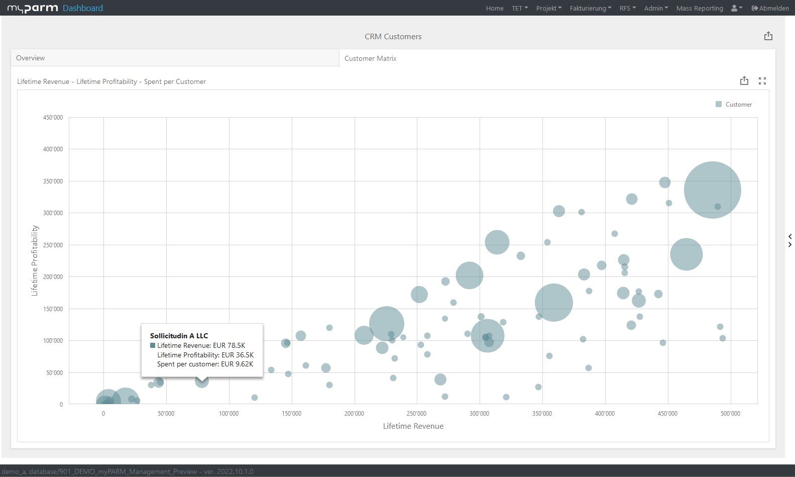
Scatter charts or scatter plots show correlations between two variables, even if they are not linear. This makes it easy to identify trends and outliers.
-
Bubble charts:
Bubble charts are a variation of scatter plots where the size of the bubbles can be used to show another, additional variable.
-
Pie charts:
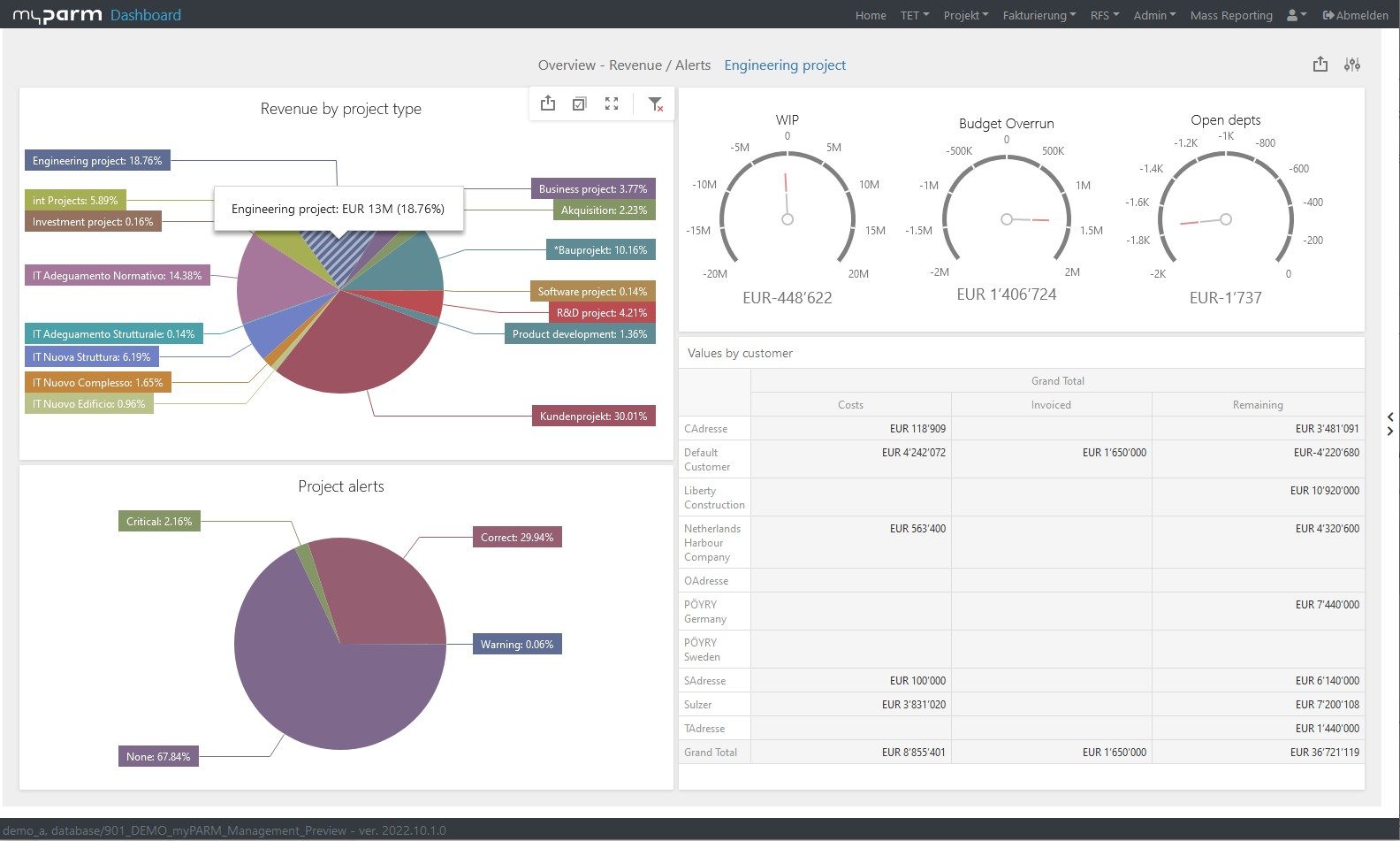
Pie charts show parts of a whole as segments and are therefore used when the composition of a variable at a certain point in time is to be shown.
-
Gauges:
Gauges are ideal for showing a single value in relation to a total or a reference value, such as a target. A coloured scale and indicator needle make this type of display quick and intuitive to understand.
-
Tables:
Tables can also be an important part of your dashboard, for example if individual viewers of your dashboard's target group need to see different values or if you want to show certain areas in detail. However, they are not as quick and easy to overview as other display options.
-
Combinations:
It is also possible to use combinations of different chart types, for example area charts, bar charts or column charts combined with a line chart. In this way, different types of values can be displayed in one graph.
Conclusion
To create a good, meaningful dashboard, some basic rules should be followed. It should be simple, not overloaded with information, adapted to the target group, easy to understand and clearly structured. If you also make sure to use the optimal chart for your purposes, the essential information will reach the viewer at a glance.
Would you like to start designing your own dashboards right away? Then try the myPARM BIactbusiness intelligence solution. We will also be happy to support you in the creation of your dashboards.
Learn more about the Business Intelligence Software Software myPARM BIact:
Would you like to get to know myPARM BIact in a demo presentation? Then make an appointment with us right away!


